Ideas for my favor editor
-
I often ponder what would constitute a "good" editor? Even for formats like BBCode, Markdown, and XHTML, which are variations of traditional editors, they rely on various buttons to insert code that ultimately expresses the final edited result as displayed on the page. Despite the advent of WYSIWYG (What You See Is What You Get) editors and Markdown's writing preview, I still feel that something is missing. So, I've been thinking whether there could be some changes or perhaps an editor—or input method—that is more user-centric, with "almost" zero learning cost for the user.
In essence, I am envisioning an editor that bridges the gap between ease of use and functionality, offering users an intuitive experience without the need for them to learn complex syntax or commands. This editor would focus on making the content creation process seamless and accessible to everyone, regardless of their technical background.
Idea 1 ——Kill all text type buttons
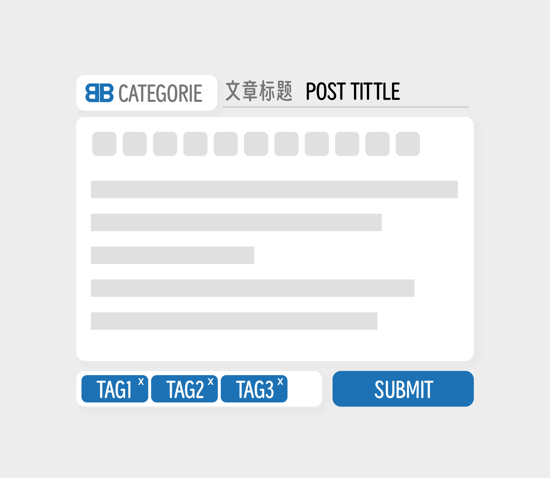
This is a classic editor interface
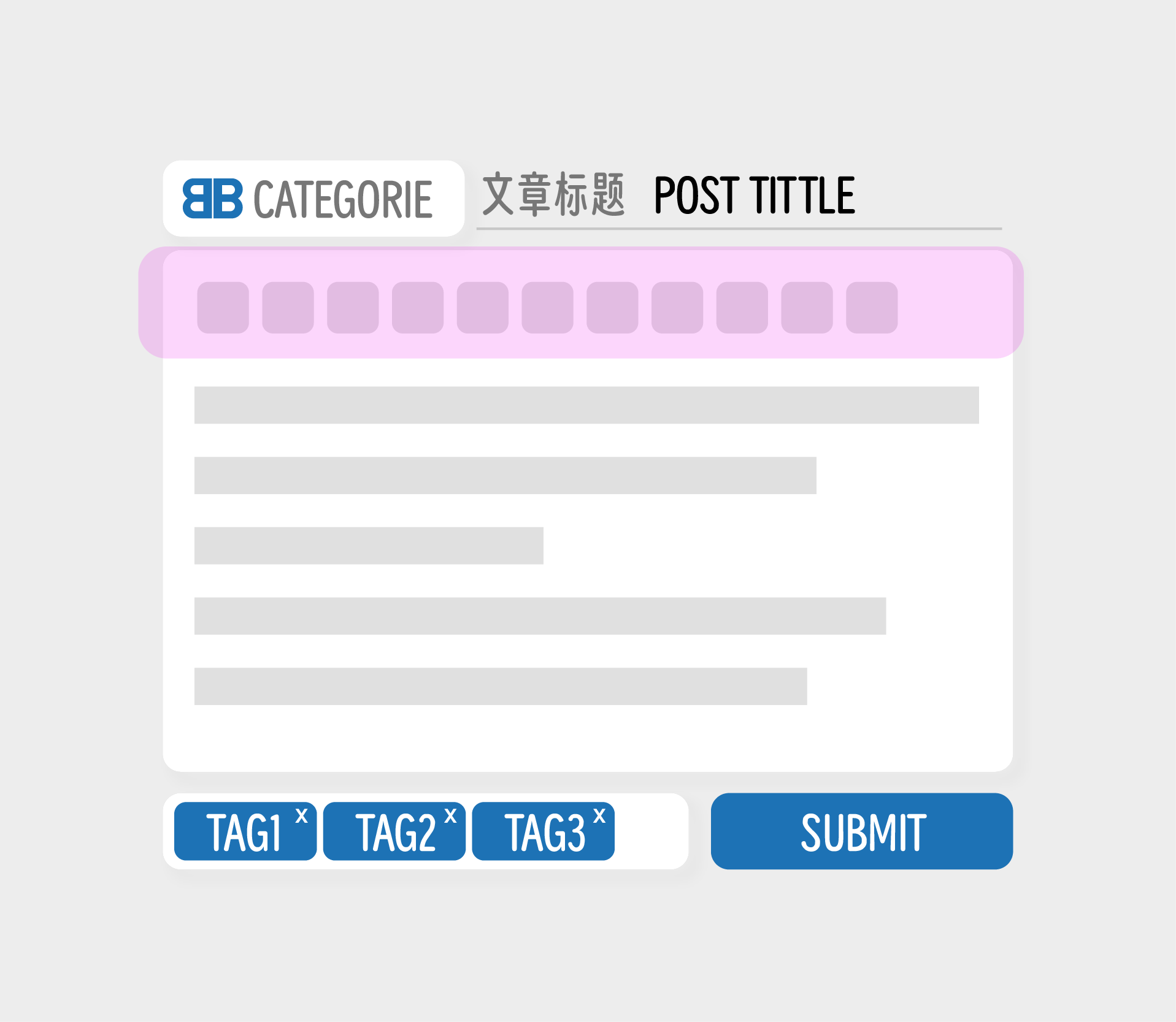
The pink areas are function buttons
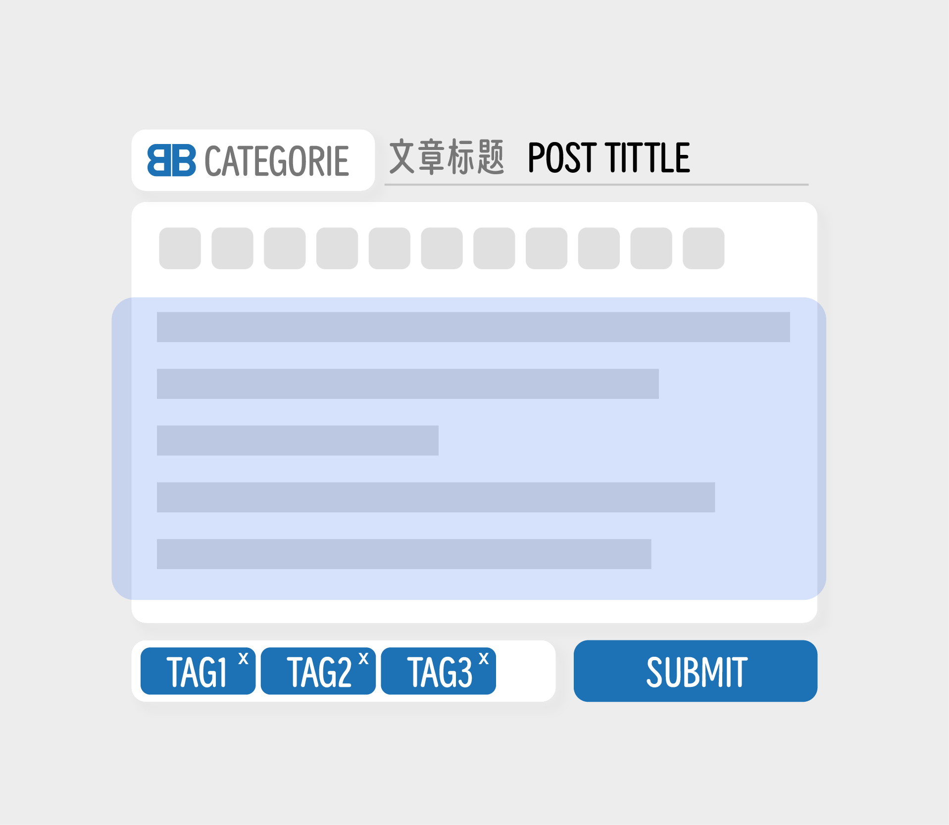
The blue area is user input area
When we typically use the posting feature, especially for the first time, the first thing we need to do is get familiar with the row of buttons at the top. Sometimes, you might even encounter users who press these buttons randomly, not fully understanding their functions.
This experience highlights the learning curve associated with traditional editors, where users must invest time in understanding how each button works and what effect it will have on their content. It can be particularly challenging for new users who may feel overwhelmed by the array of options available to them, leading to potential misuse or confusion about the editor's capabilities.
What I'm considering is eliminating all preset buttons.
By removing the preset buttons, the aim is to simplify the interface and reduce the initial learning curve for new users. Instead of overwhelming users with a variety of options they may not immediately understand, this approach seeks to provide a more intuitive and user-friendly experience. It challenges the traditional design of editors that rely heavily on buttons for formatting and instead explores alternative methods that could make content creation more accessible and straightforward.
This concept might involve using context-aware tools, natural language processing for commands, or an intelligent assistant that understands user intent and formats the content accordingly. The goal would be to create an environment where users can focus on their content without needing to learn a set of rules or syntax, thereby achieving a nearly zero learning cost while still allowing for rich text editing capabilities.For more information on how my idea was realized, please continue reading....
Idea 2——Preset the article as multiple paragraphs
My thought process is like this: What is the purpose of an editor that we need?
Or, what is the purpose of having buttons on an editor?
The answer is quite simple: it is to make the content more readable. For an article to be easily readable, it must necessarily include punctuation (obviously), paragraphs, images, charts, as well as various quotations, annotations, and so on.
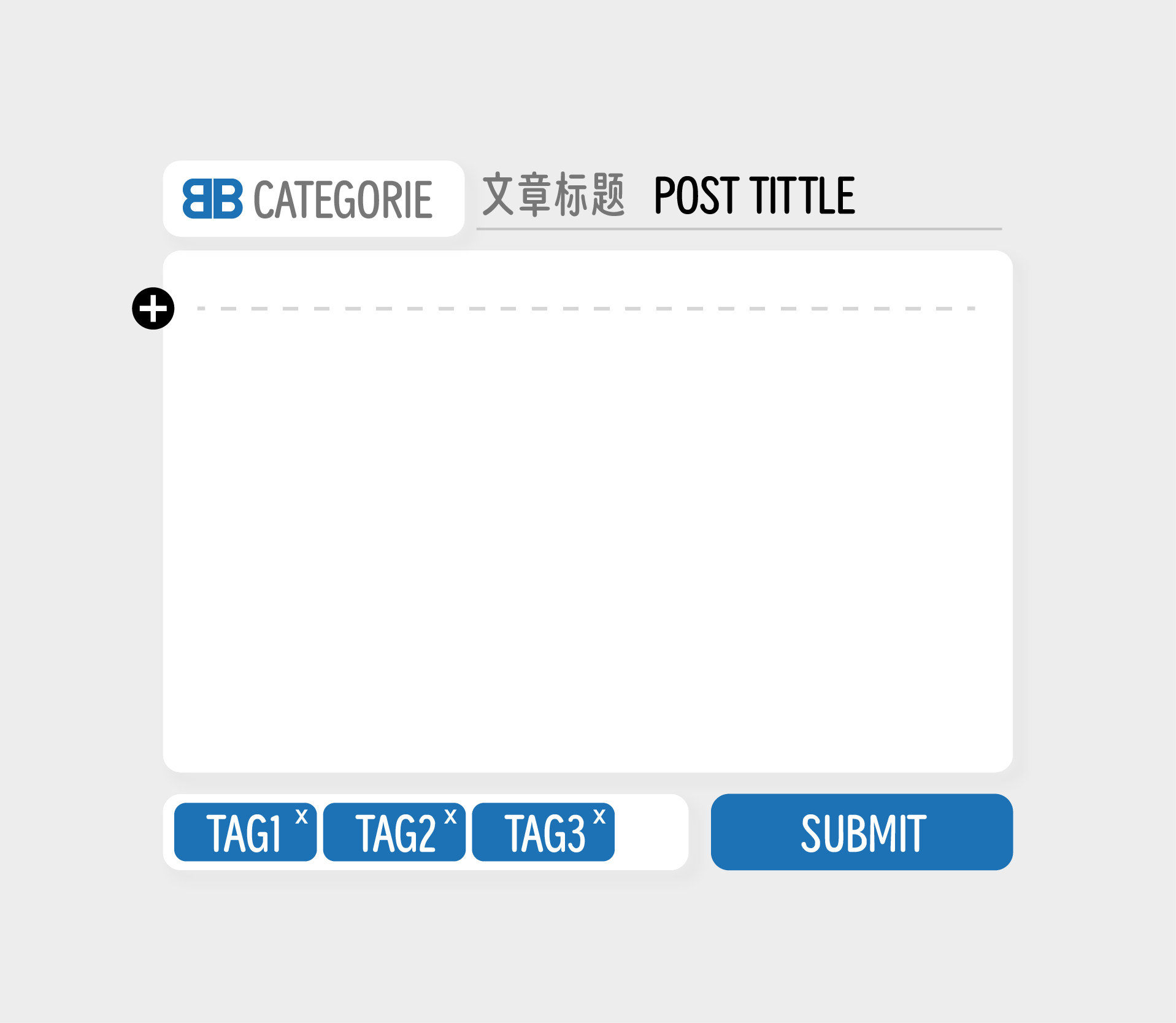
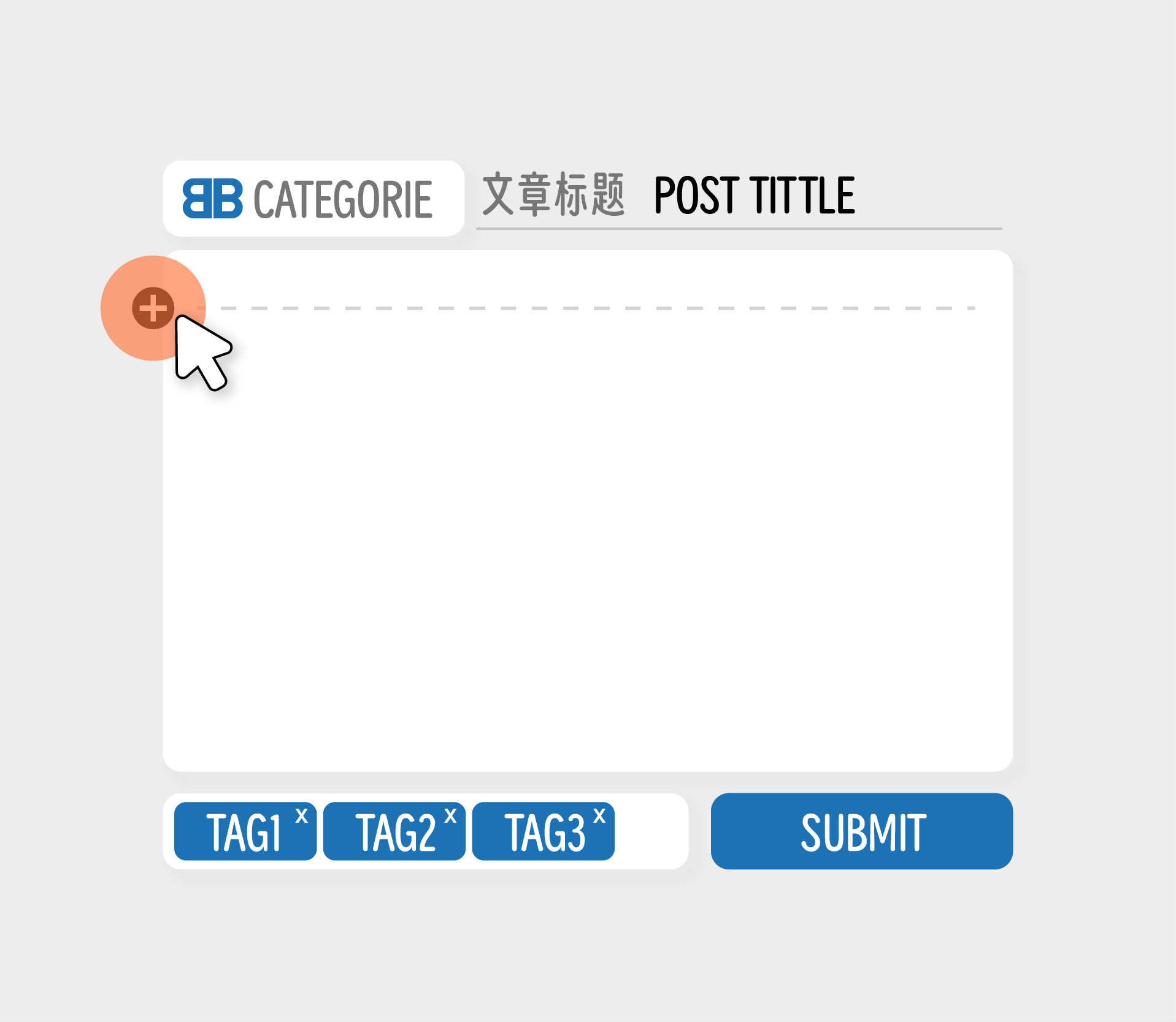
So, we could design it in such a way that the article is divided into multiple paragraphs. Users would add paragraphs as needed and choose what content to fill in each paragraph. This approach allows for a more structured writing process where users can focus on one section at a time, ensuring that each part of their content is well-developed and organized.
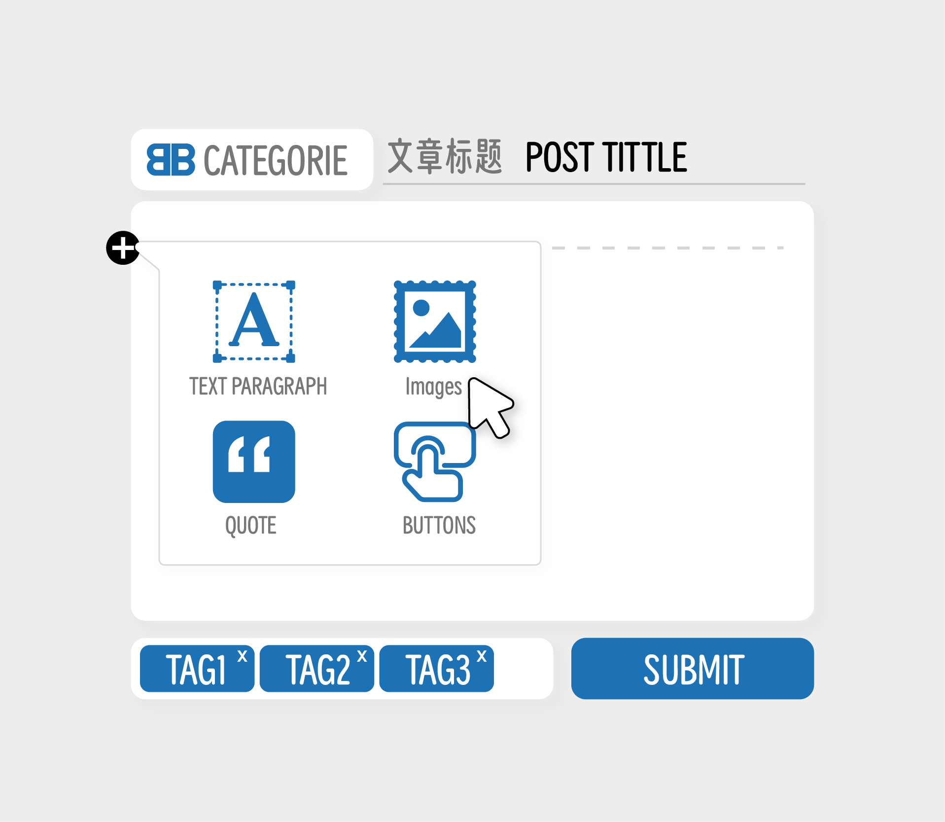
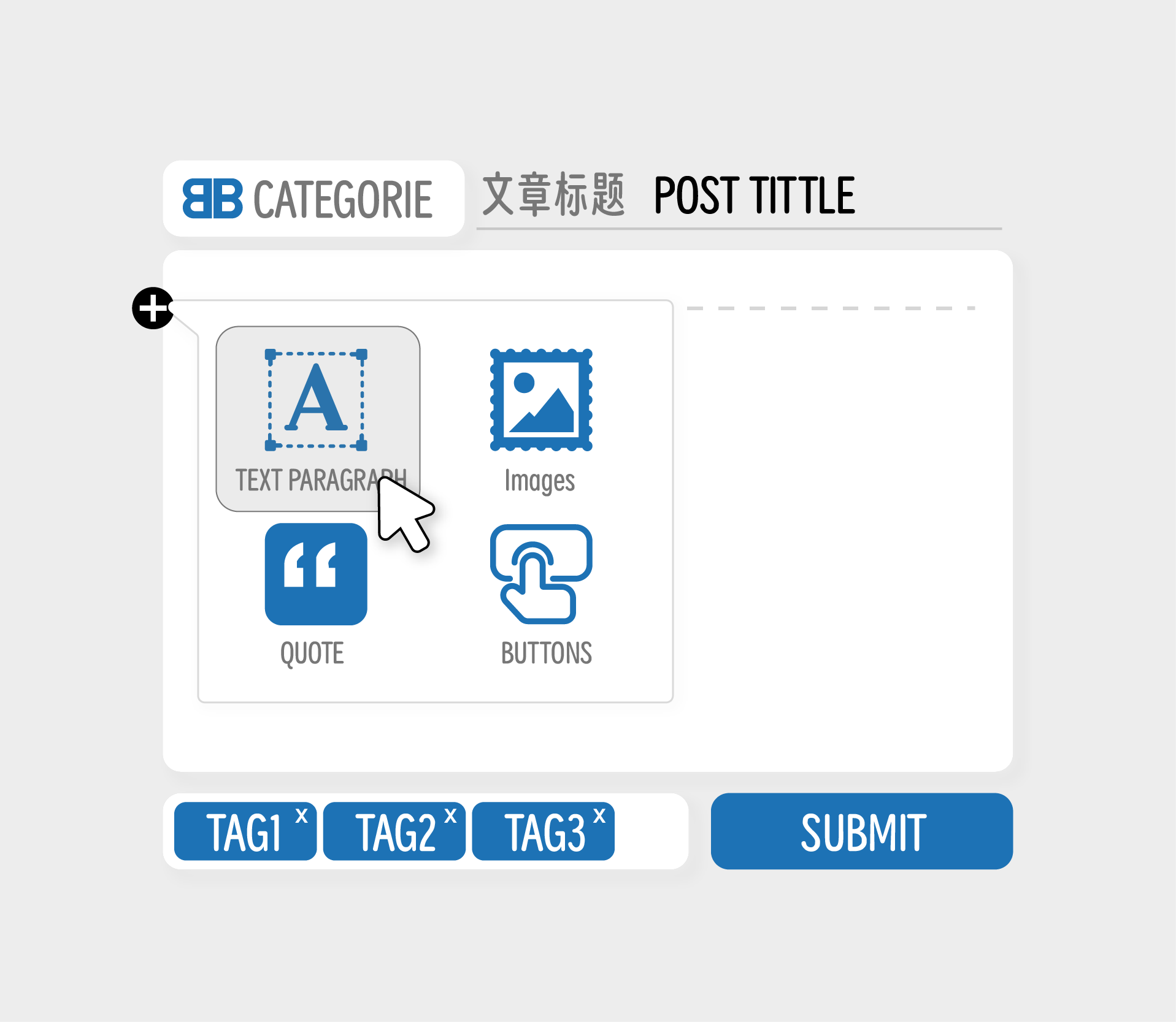
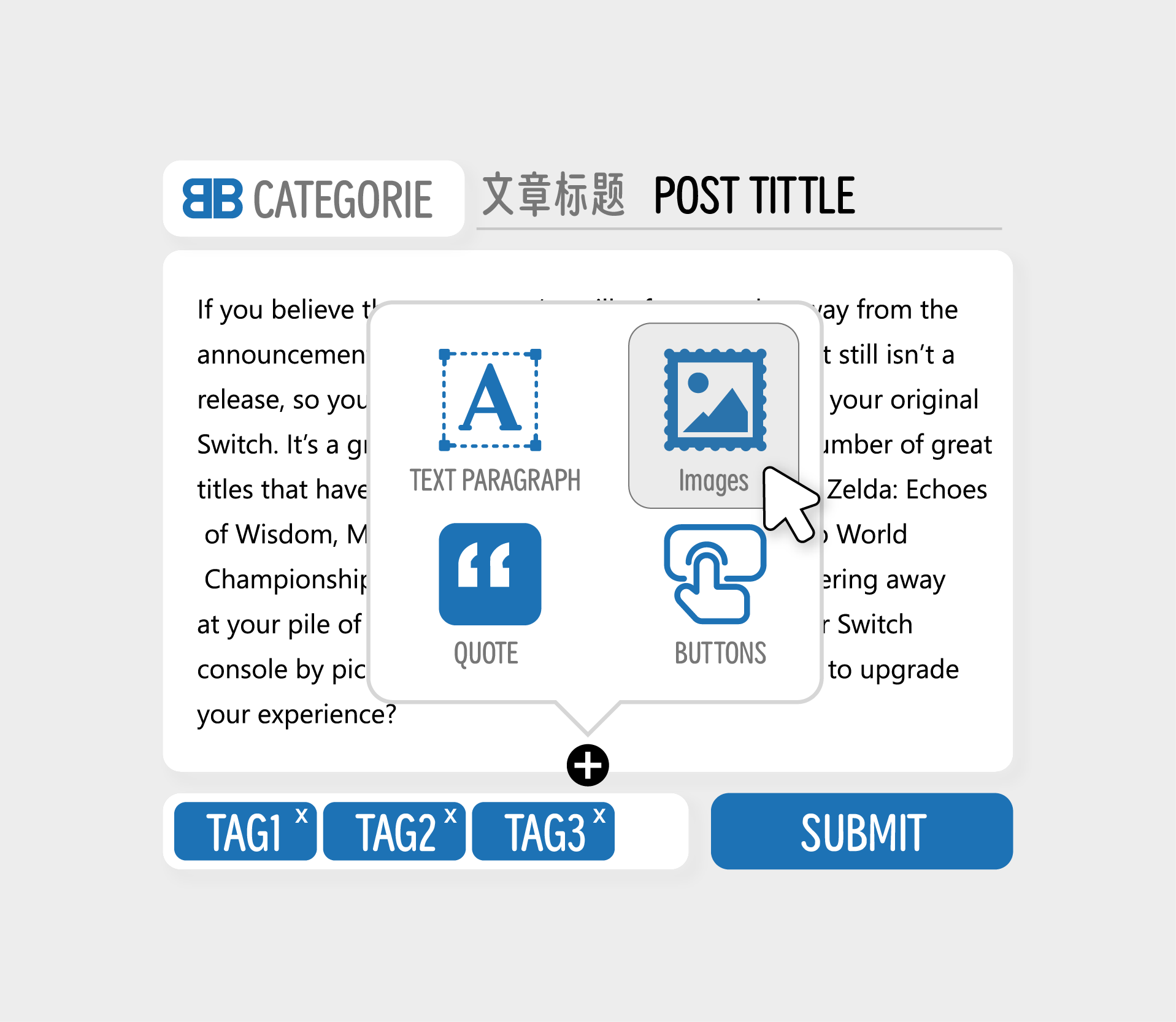
Here, I roughly divide the commonly used elements into four groups (though in practice, there could be many more): Text Paragraphs, Image Paragraphs, Quote Paragraphs, and Custom Button Paragraphs.
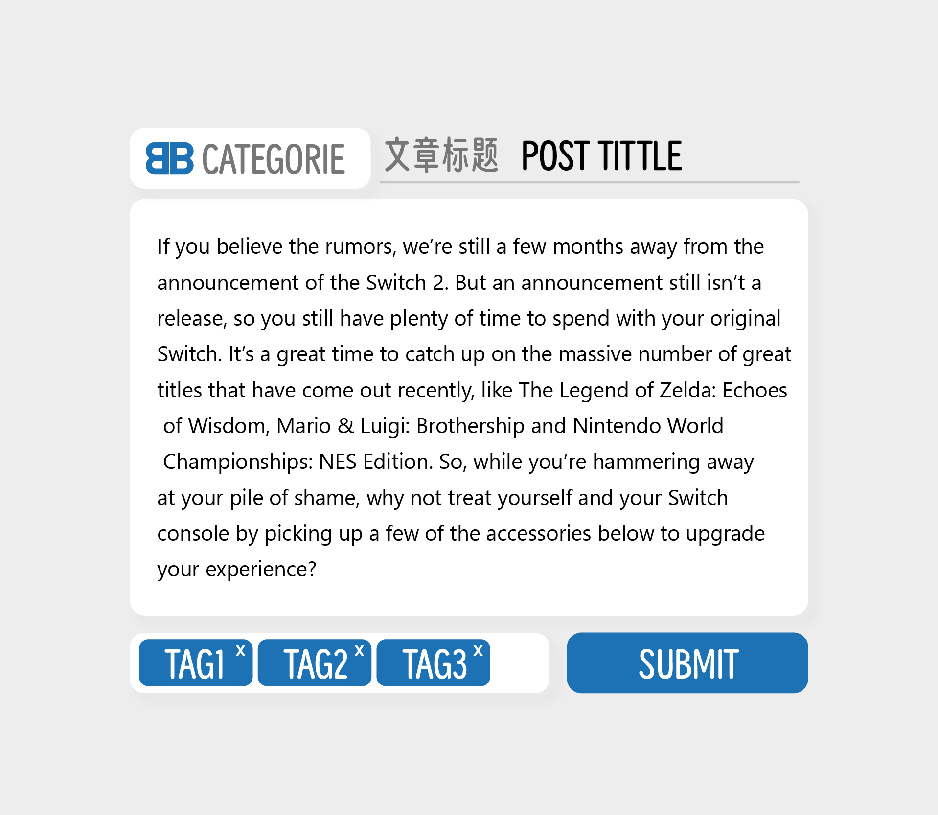
Let's take a text paragraph as an exampleWhen we choose to insert a text paragraph
text paragraph example
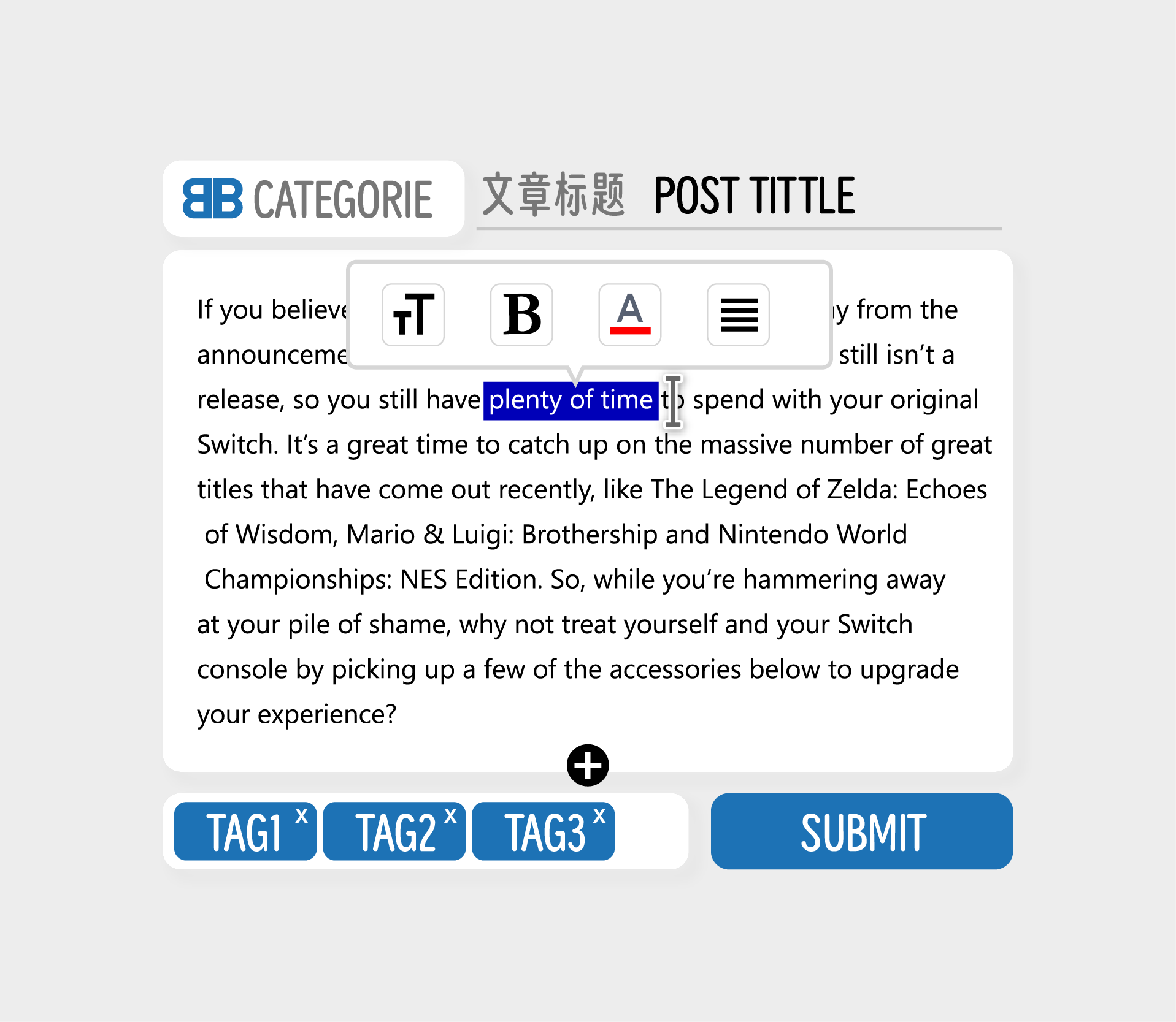
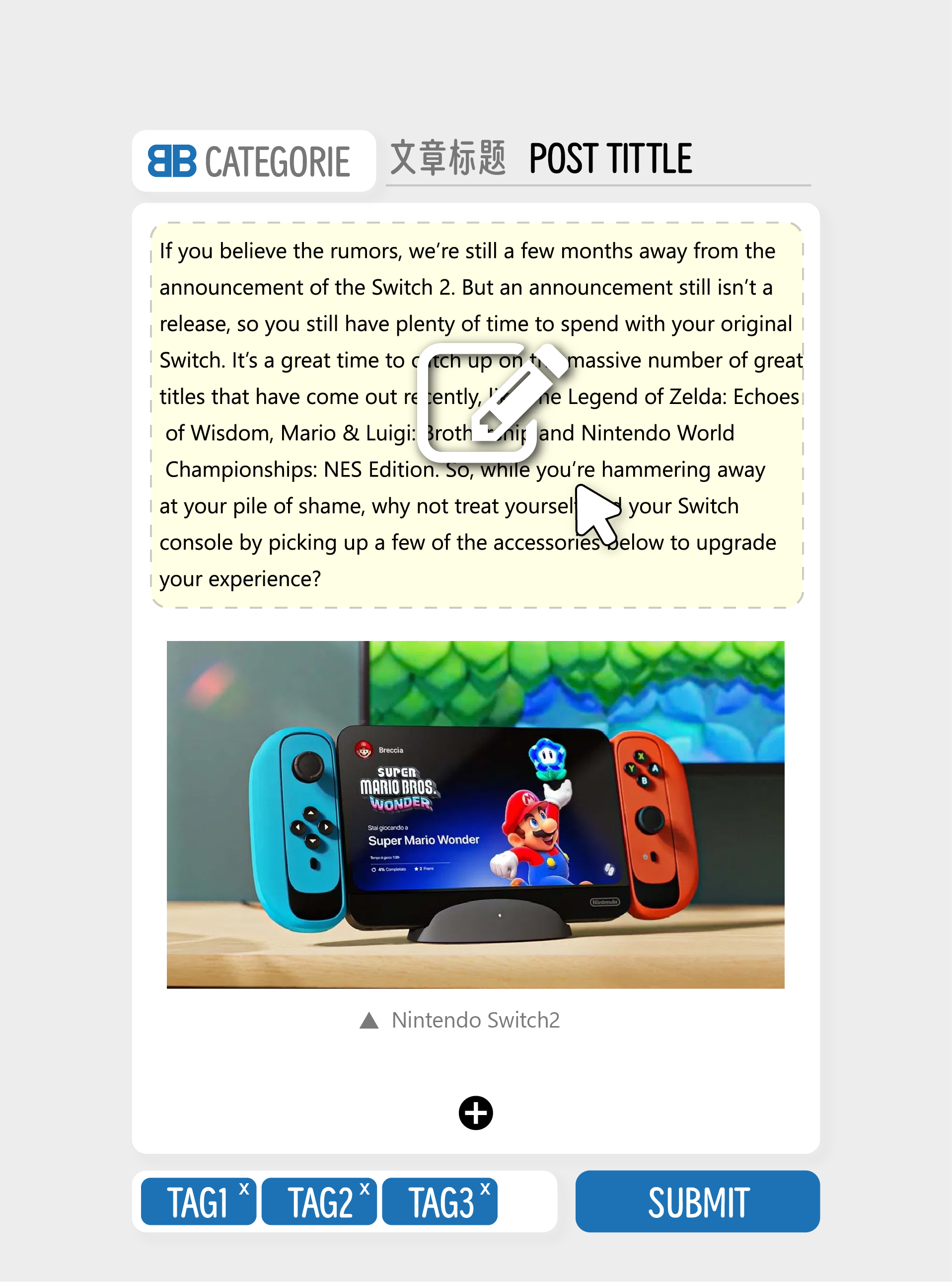
Once users opt for a Text Paragraph, they are presented with a clean, button-free interface where they can begin typing their content immediately. This minimalist approach minimizes distractions and allows users to focus on writing without worrying about formatting at the outset. After the user finishes typing and selects the text they wish to format, a contextual menu automatically appears
Of course, this is just my own idea, and I'm considering it from the perspective of a complete novice user who has no experience with Markdown or other markup languages.
This approach aims to make the editing process as intuitive and user-friendly as possible for individuals who may not be familiar with coding or complex formatting languages. By simplifying the interface and postponing the introduction of formatting options until after the text is input, it caters to users who might feel intimidated by traditional editors filled with buttons and commands.
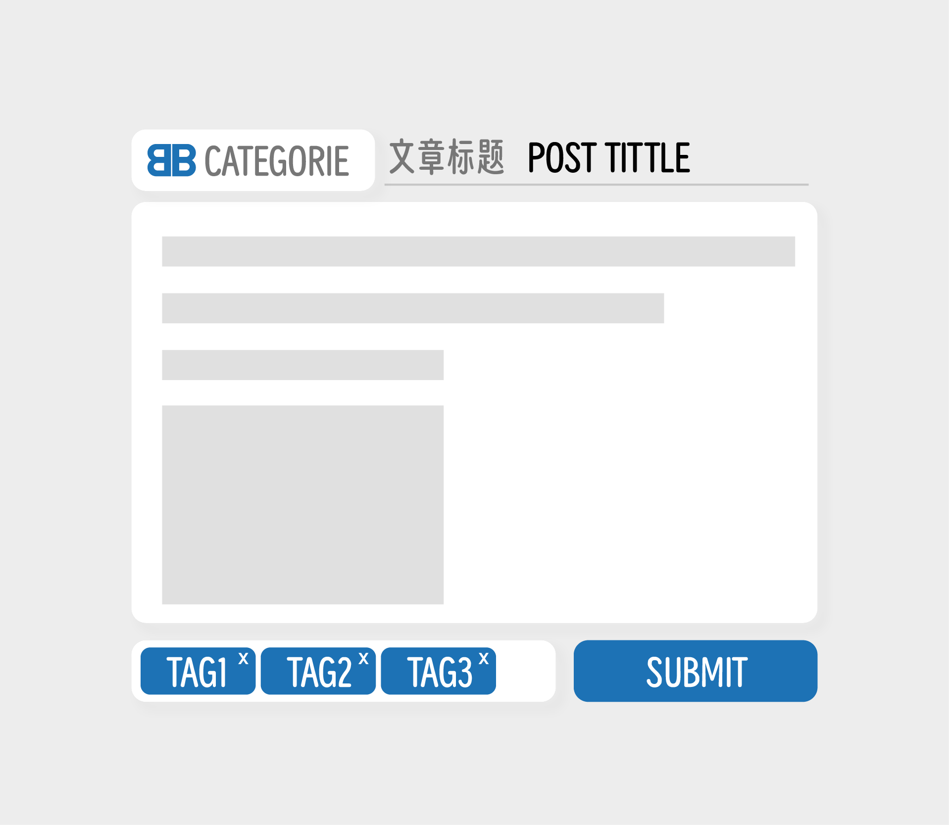
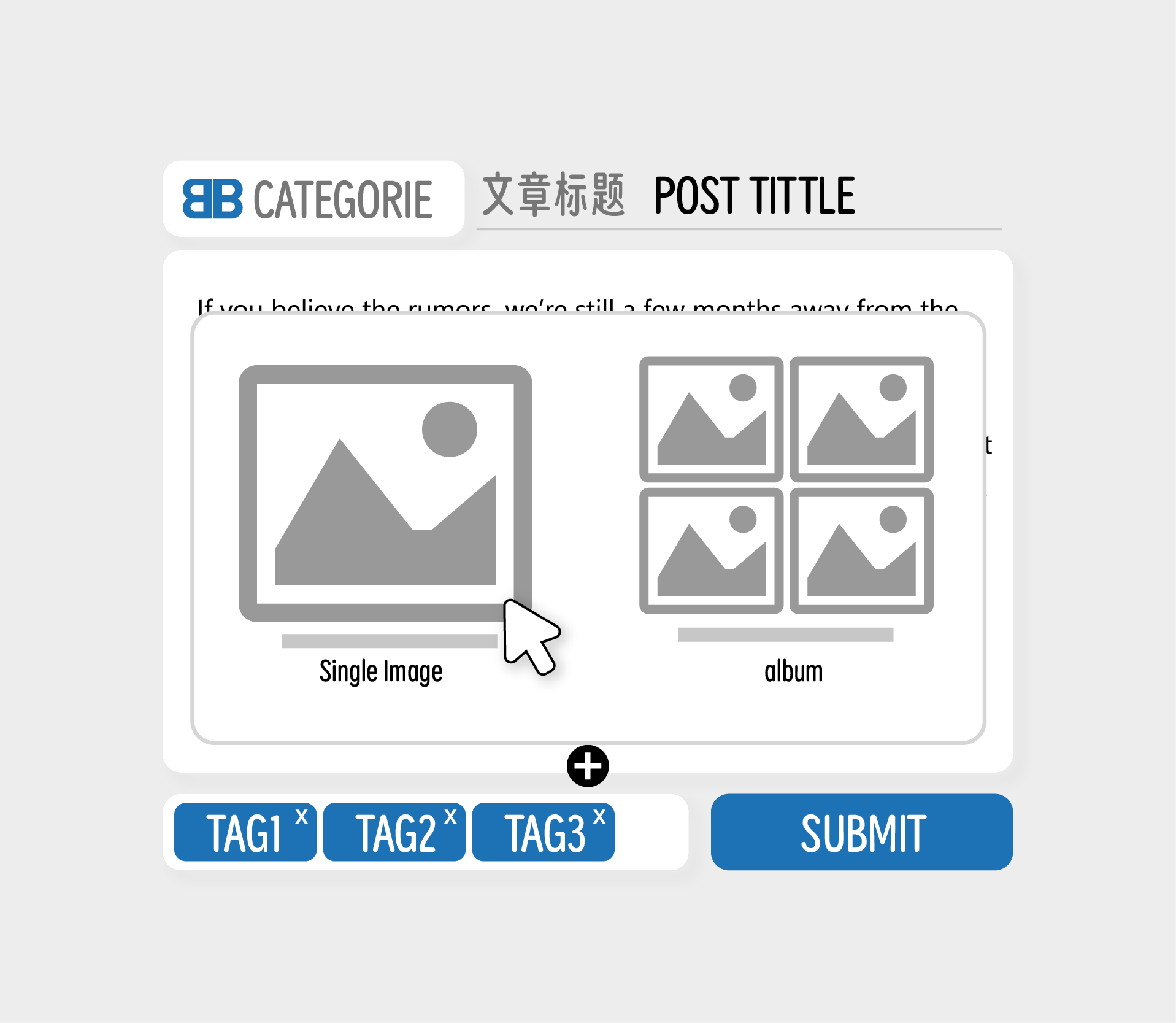
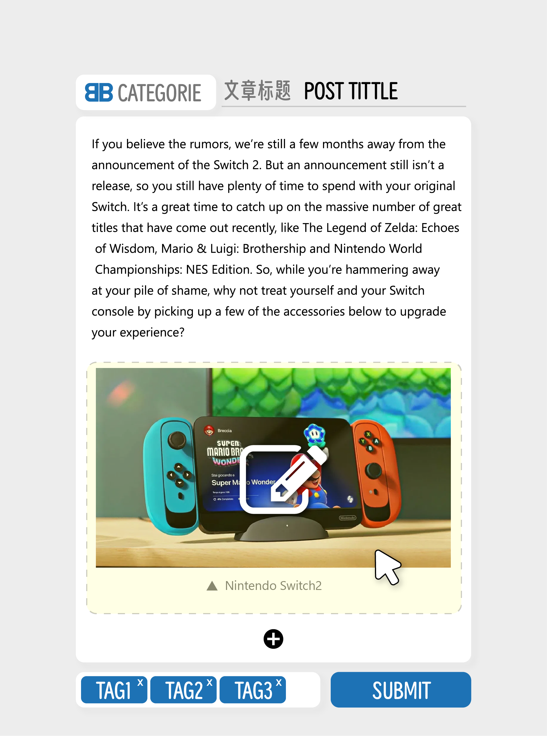
By prioritizing ease of use and minimizing the initial complexity, the editor can empower users to express themselves more freely and confidently, ultimately leading to better and more engaging content creation.image paragraph example
This is a demonstration of an Image Paragraph.
About Edit post
When it comes to editing articles, we can also opt to edit paragraphs directly instead of editing the entire article. This method provides much greater flexibility.
Of course, these are all just my own ideas, and I welcome any opinions or suggestions from others for discussion.
-
phenomlab@community.nodebb.organtwortete an juse@community.nodebb.org zuletzt editiert von
This approach looks more like Gutenberg and page blocks for WordPress, which markdown (and by default, NodeBB) isn't. the entire point of markdown is to simplify syntax and once you get used to it, it's hard to go back to standard WYSIWYG editors in my view.
However, I do understand the genesis, but hiding the buttons simply removes functionality the user may want in my option. have you tried the Quill editor?
-
juse@community.nodebb.organtwortete an juse@community.nodebb.org zuletzt editiert von
This approach isn't merely about eliminating buttons but about strategically placing them where they make the most sense. The goal is to enhance the user experience by ensuring that buttons and formatting options appear only when they are contextually appropriate and necessary. For instance, when a user is typing within a text paragraph, the interface remains clean and uncluttered. However, once the user selects a portion of the text, a contextual menu of formatting options—such as text size, bold, italic, etc.—appears right where it's needed.
By adopting this philosophy, the editor can guide users through the content creation process more intuitively. Users can focus on writing without being distracted by unnecessary tools, and when they do need to format their text, the options are readily available and easy to use. This not only streamlines the editing process but also ensures that users feel empowered and in control, leading to a more satisfying and efficient experience overall.
In essence, this design aims to balance simplicity with functionality, offering users the power to create richly formatted content while maintaining an intuitive and accessible interface. It's about making the editor smarter, so it adapts to the user's needs, rather than requiring the user to adapt to the editor.
-
juse@community.nodebb.organtwortete an phenomlab@community.nodebb.org zuletzt editiert von
@phenomlab said in Ideas for my favor editor:
This approach looks more like Gutenberg and page blocks for WordPress, which markdown (and by default, NodeBB) isn't. the entire point of markdown is to simplify syntax and once you get used to it, it's hard to go back to standard WYSIWYG editors in my view.
However, I do understand the genesis, but hiding the buttons simply removes functionality the user may want in my option. have you tried the Quill editor?
Yes, it does resemble Gutenberg in its modular approach but with a focus on simplicity and ease of use. The key idea is to retain the Markdown format while streamlining the user interface, ensuring that buttons and tools are categorized and only appear when necessary. This dual approach caters to both experienced Markdown users who prefer direct text input and novice users who benefit from guided formatting options.
-
juse@community.nodebb.organtwortete an juse@community.nodebb.org zuletzt editiert von
this approach not only enhances the user experience but also lays a robust foundation for future feature expansion.
By categorizing and modularizing the editor’s components, developers gain greater flexibility in adding new functionalities and custom paragraph types, allowing for richer and more dynamic content display.
-
julian@community.nodebb.organtwortete an juse@community.nodebb.org zuletzt editiert von
@juse keep in mind that hiding toolbar buttons away behind overflow menus broadly decreases usage of formatting tools. It's not necessarily a bad thing, but something to consider.
Also when tools are dynamically drawn (e.g. on hover over some highlighted text), that breaks accessibility guidelines. a11y isn't why we had a toolbar, although it coincidentally does satisfy accessibility constraints.
I am all for a more streamlined view, and perhaps the default composer isn't there yet, but I also very much dislike UIs that constantly shift elements in and out depending on UI state.
A clean visual field is my preference, and static toolbar buttons, despite taking up space, still work for me.
